


From 1995 to now: a life in 30 album covers
And some favorite cover art from 2025 so far

If you’re wondering why you’re reading this on a Thursday instead of Wednesday, that’s because I’ve come to learn that publishing on Thursdays is simply more convenient for my weekly schedule. Today also happens to be my 30th birthday. Alas, its my birthday and I can publish if I want to.
I was more worried about the idea of turning 30 three years ago than I am now. Instead of feeling like the old among the young, I get to feel like the young among the old. It’s the start of a new decade, so naturally I’ve been doing a lot of reflecting recently. There’s still some loose ends, but I’ve got a few solid conclusions under my belt: no one is thinking about me as much as I’m thinking about me and being afraid to be seen trying is super lame. Does it feel cringe at times to write this newsletter? For sure. Is that feeling canceled out by the notification I got this morning that said 12x12 is #94 rising in the design category on Substack? Definitely.

With all of that out of the way, its time to reflect on 30 years of album art. These are some of my favorites from each year I’ve been alive.

1995 - Liquid Swords, GZA

A cover that could make Tipper Gore burst into tears. Spectacular. The concept came to GZA in a weed-fueled, high(literally)-intensity chess game with fellow Wu-Tang Clan member Masta Killa in 1992. A few years later it became the cover art for GZA’s debut solo album. It even has an alt version of the classic Wu-Tang “W” logo, flipped sideways to read as a “G.”
1996 - Odelay, Beck

For a long time, I admittedly didn’t know if this was a real dog or not, but it is! A Komondor to be exact. The cover idea came from Beck’s girlfriend at the time, with the Komondor photo originally taken for American Kennel Club's Gazette in 1977.
1997 - Homework, Daft Punk

It’s the album that started it all. Daft Punk certainly wasn’t the first artist to latch onto one logo for the entirety of their career, but I do find it kind of wild that they came in so hot with songs like “Around the World” and “Da Funk” that their debut cover stayed with them until the end.
1998 - The Miseducation of Lauryn Hill, Lauryn Hill

People consider The Miseducation of Lauryn Hill to be sacred listening and there’s no disagreeing with that. It’s a concept album about educating one’s self on love through relationship complexities, interpersonal conflicts, motherhood, and faith. Throughout the record you can hear moments at the end of some songs where a teacher is asking a classroom of students about their feelings on love. The carved desk concept for the cover art was only natural.
1999 - Millennium, Backstreet Boys

I used to believe this is what heaven looked like. Styling and all.
2000 - Renegades, Rage Against The Machine

Even if you don’t know any of the music, you know this cover. Or you’ve at least seen a piece from Robert Indiana’s Love art series, which is what inspired Renegades.
2001 - Toxicity, System of a Down

This record may have been banned from radio stations in the days after 9/11, but nothing could stop the cover from becoming the icon it is today. Getting there wasn’t easy, though. Each band member had a different album title and vision for the artwork, with little room for compromise among the disparate ideas. It was Shavo Odadjian, the band’s bassist, who ultimately wanted to use the Hollywood sign concept as a way to make their mark on their hometown of LA. Apparently they paid $20,000 to the Hollywood Chamber of Commerce for the album and merchandising rights.
2002 - The Eminem Show, Eminem

Nothing hit harder in third grade than hearing “Without Me” on the radio. Not that I had any idea who Ms. Cheney or Moby was at the time. This was the first of three Eminem records to prominently feature him on a stage, with each cover seemingly representing a different act of a performance with The Eminem Show setting the scene with him sitting alone behind a red curtain, Encore showing him taking a bow with people in the crowd under an icier blue light, and Curtain Call ending the series with roses at his feet.
2003 - Streetcore, Joe Strummer & The Mescaleros

Streetcore was the third and final solo album from Joe Strummer, former lead man of The Clash, and was released after his death in 2002. The artwork was created by Strummer himself, which feels like an appropriate personal touch to close out a monumental career. This kind of simple illustration is like crack to me.
2004 - Funeral, Arcade Fire

Undeniably twee.
2005 - Demon Days, Gorillaz

The Beatles of animated bands.
2006 - Black Holes and Revelations, Muse

This cover has so many strange details when you look closely. Each guy meant to represent the four horsemen of the apocalypse has a different suit pattern, there’s mini horses running on the table, which is also looks like it’s on Mars. It’s almost hidden by the clouds, but if you look near the logo, you can see Earth and the Moon in the distance.
2007 - Riot, Paramore

This is the point at which Paramore really owned the color orange. The all-over type design feels like a nod to No Doubt’s Rock Steady cover art.
2008 - Viva La Vida Or Death And All His Friends, Coldplay

I distinctly remember the day I bought this CD from Target (it was also the first time I ever bought Skullcandy wired earbuds, my go-to for years). Big day. Bigger album. There’s a solid chance that there are people in existence who will see the Liberty Leading the People painting by Eugène Delacroix from 1830 hanging in the Louvre and say, “isn’t that a Coldplay record?”
2009 - Man On The Moon: The End Of Day, Kid Cudi

You could probably call this cover art the grandfather of the galaxy print trend that took over in the early 2010s. For a debut album, this record was massively successful and became the soundtrack to my high school years. Very much an album cover I associate with my old iPod.
2010 - Pink Friday, Nicki Minaj

My greatest memory of this debut album is listening to it on repeat through MySpace music, wondering the entire time how Nicki Minaj’s leg looked so long when she is only 5’2”. I’m the same height and I certainly don’t look as lengthy.
2011 - Born This Way, Lady Gaga

There’s nothing I could say that would be better than Gaga’s own words: “It's an easy rider [by Harley-Davidson]. I am half fantasy and half reality. And I am endless in my ability to transform. And I am also always in a constant state of journey and I am married to the process. I'm not riding anywhere. You don't see the bike going away from or towards anything. It's not on a road it's in space, it's in blackness, emptiness. For me the motorcycle represents the ride. Me as the bike represents me as a woman on the run, a woman on a ride. And a never ending ride in space, in time.”
2012 - An Awesome Wave, alt-J

At the end of 2019, Spotify included some “best of the decade” personalized stats in their Wrapped campaign. When I told one of my friends that my top artist for the decade was alt-J, he laughed and said, “that’s so 2012 of you.” Although the days of Obama’s America were behind us, my spirit was still there, fixed on this psychedelic edit of the Ganges river delta.
2013 - AM, Arctic Monkeys

You know it, you love it. Or maybe you hate it because it was literally everywhere. Either way, its as classic as the early 2010s can get.
2014 - Salad Days, Mac DeMarco

I don’t think I felt this at the time of its release, but this cover often makes me feel like the lyrics of the title track “Salad Days.” It’s stripped-down, similar to the music inside. Love the film grain, tree branch shadows, and chicken scratch handwriting—it all helps paint a hazy image of nostalgia.
2015 - Depression Cherry, Beach House

Sometimes the cover is just red—velvet, that is.
2016 - The Beautiful Game, Vulfpeck

Aside from my being a Vulfpeck stan, this cover always appealed to me. It’s bright and saturated. You can feel band leader Jack Stratton’s movement the same way you can feel the warmth from the golden hour light that’s shining on him. Plus, I like all of the stripe moments.
2017 - Gumboot Soup, King Gizzard & The Lizard Wizard

King Gizzard & The Lizard Wizard released five albums in 2017 and I can barely write one newsletter per week. The final album of the year was Gumboot Soup and its my favorite illustration of that bunch. It was designed by Australian artist Jason Galea, a longtime KGLW collaborator who has created over 20 album covers for them. The prolific nature of this partnership is definitely something I plan to dedicate an entire issue to in the future, so stay tuned for that.
2018 - ASTROWORLD, Travis Scott

From a distance this artwork is bright, with a gleaming blue sky and kids jumping for joy in the foreground. When you look closer at the details of the carnival scene, like food and garbage splayed across the ground, a beat up car, and hazy light coming from the central Travis balloon that’s almost fiery, the image unfortunately starts to feel like a subtle foreshadowing of the Astroworld Festival tragedy that happened in 2021.
2019 - Titanic Rising, Weyes Blood

I’ve always appreciated the ethereal feel this cover has between the range of purple-ish blue and orange colors and the translucent window curtains floating freely. Titanic Rising is part of a long line of covers that are set underwater, a lot of which have been released in recent years. Music industry designer, Rachel Cabitt, wrote about the trend here.
2020 - Fetch the Bolt Cutters, Fiona Apple

Probably my most listened to no-skip album. During the early covid times, there were days where I was listening to this front to back several times a day. To this day, if one of the songs pops up when my Spotify library is on shuffle, I often just listen to it all again Cartman-style. It’s raw, unpolished, and deeply personal, so the handmade cut-and-paste cover perfectly matches that energy.
2021 - WE ARE, Jon Batiste

Another favorite no-skip album for me. Jon Batiste has called this album “a representation of genreless music that’s just about the story,” one of community, heritage, and personal journey. The cover is striking, but still has a level of intimacy and warmth to it that is really inviting.
2022 - Cave World, Viagra Boys

The Cave World cover rocks. The primary-adjacent color palette. The texture and linework style. The shrimp that somehow always makes its way into Viagra Boys’ music. Designed by Swedish illustrator and cartoonist Moa Romanova, the off-kilter comic-style artwork has made it onto several of my mood boards ever since its release.
2023 - Comfort to Me, Amyl and The Sniffers
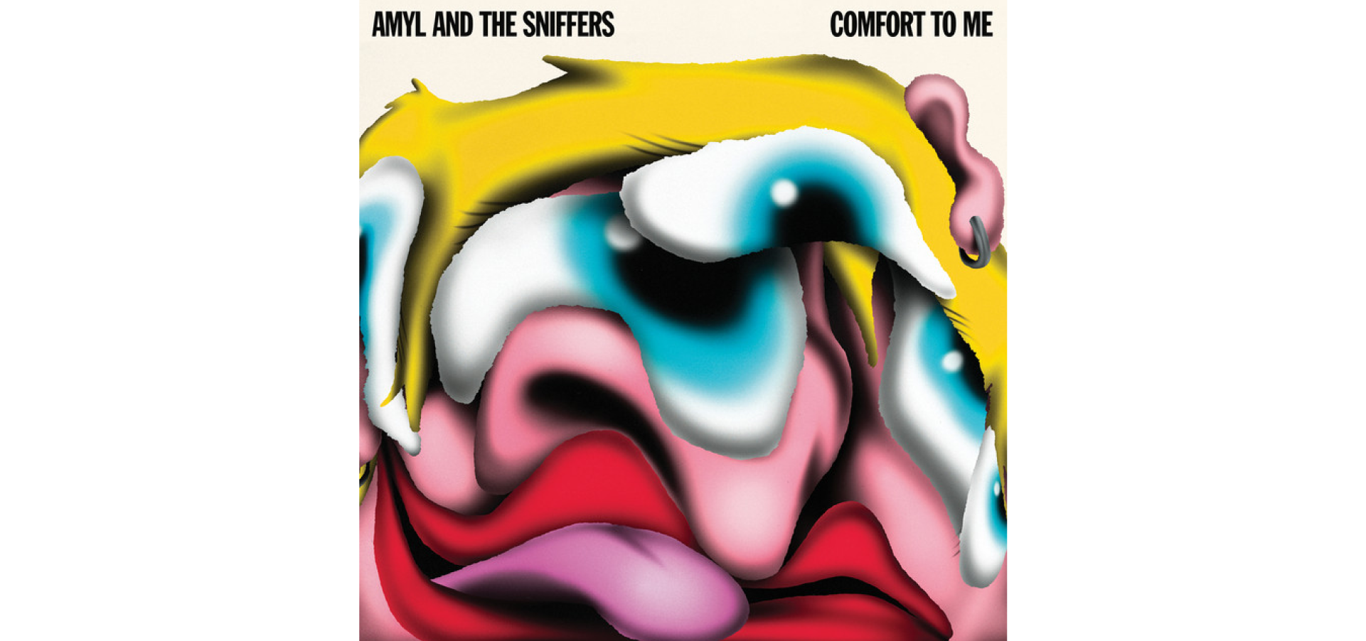
I love this band so much and there’s few and far between lead women who are as genuine and unapologetic about who they are as Amy Taylor. Braulio Amado, the illustrator behind the cover, matched her freak in the most incredibly weird way.
2024 - Brat, Charli xcx

No notes.

Even though we’re halfway through 2025, I need the whole year to pass before making a call on any kind of definitive “favorite” cover, but here are some that I’ve enjoyed so far.

Debí Tirar Más Fotos, Bad Bunny (Rimas Entertainment) Photography by Eric Rojas
Something Beautiful, Miley Cyrus (MCEO Inc.) Photography by Glen Luchford
Sinister Grift, Panda Bear (Domino Recording Co) Art Direction by Björn Copeland, design by Rob Carmichael

💿 Playlist: get in loser, we’re dissociating from American fascism
🎥 The internet’s favorite music critic, Anthony Fantano, went on The Adam Friedland Show
📸 Sabrina Carpenter’s recent cover story for Rolling Stone, photographed by David LaChapelle
📕 Serj Tankian’s memoir featuring System of a Down drama, Armenian history, and reflections on post-9/11 censorship
💚 An article from The Sociology of Business newsletter unpacking the marketing masterclass that was Brat summer